Timer
# Time till break ends
import time
from IPython.display import display, HTML
def countdown_timer(minutes, seconds):
display(HTML(f"""
<p id="timer" style="font-size:300px; color: red;"></p>
<script>
var minutes = {minutes};
var seconds = {seconds};
var timer = document.getElementById("timer");
function updateTimer() else else
var minutesDisplay = minutes.toString().padStart(2, '0');
var secondsDisplay = seconds.toString().padStart(2, '0');
timer.innerHTML = minutesDisplay + ":" + secondsDisplay;
setTimeout(updateTimer, 1000);
}}
}}
updateTimer();
</script>
"""))
# Run the countdown timer for x minutes xx seconds
countdown_timer(0, 1)
Uploading files to Google Drive and other ways
from google.colab import files
uploaded = files.upload()
--------------------------------------------------------------------------- KeyboardInterrupt Traceback (most recent call last) <ipython-input-14-21dc3c638f66> in <cell line: 2>() 1 from google.colab import files ----> 2 uploaded = files.upload() /usr/local/lib/python3.10/dist-packages/google/colab/files.py in upload() 67 """ 68 ---> 69 uploaded_files = _upload_files(multiple=True) 70 # Mapping from original filename to filename as saved locally. 71 local_filenames = dict() /usr/local/lib/python3.10/dist-packages/google/colab/files.py in _upload_files(multiple) 154 155 # First result is always an indication that the file picker has completed. --> 156 result = _output.eval_js( 157 'google.colab._files._uploadFiles("{input_id}", "{output_id}")'.format( 158 input_id=input_id, output_id=output_id /usr/local/lib/python3.10/dist-packages/google/colab/output/_js.py in eval_js(script, ignore_result, timeout_sec) 38 if ignore_result: 39 return ---> 40 return _message.read_reply_from_input(request_id, timeout_sec) 41 42 /usr/local/lib/python3.10/dist-packages/google/colab/_message.py in read_reply_from_input(message_id, timeout_sec) 94 reply = _read_next_input_message() 95 if reply == _NOT_READY or not isinstance(reply, dict): ---> 96 time.sleep(0.025) 97 continue 98 if ( KeyboardInterrupt:
!wget https://scg-static.starcitygames.com/articles/2024/06/28524b09-rick-astley.jpg
--2024-09-26 17:13:48-- https://scg-static.starcitygames.com/articles/2024/06/28524b09-rick-astley.jpg Resolving scg-static.starcitygames.com (scg-static.starcitygames.com)... 104.21.81.46, 172.67.188.44, 2606:4700:3036::ac43:bc2c, ... Connecting to scg-static.starcitygames.com (scg-static.starcitygames.com)|104.21.81.46|:443... connected. HTTP request sent, awaiting response... 200 OK Length: 259604 (254K) [image/jpeg] Saving to: ‘28524b09-rick-astley.jpg’ 28524b09-rick-astle 100%[===================>] 253.52K --.-KB/s in 0.03s 2024-09-26 17:13:48 (8.11 MB/s) - ‘28524b09-rick-astley.jpg’ saved [259604/259604]
!ls
Imports
import cv2
import pdb
import os
import numpy as np
import matplotlib.pyplot as plt
import scipy.ndimage as ndimage
import ipywidgets as widgets
import scipy.signal, scipy.misc
from mpl_toolkits.mplot3d import Axes3D
from skimage import data
from skimage.color import rgb2gray
from math import *
from PIL import Image
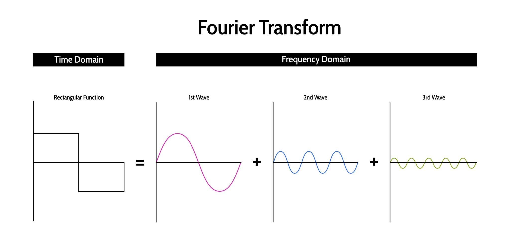
Fourier Transform
This is a very cool page to understand FTs (clicky-clicky)
The Fourier Transform (FT) is arguably the most significant algorithm in signal processing and computer vision. It provides a mathematical way to look at a signal from a different perspective.
The Core Concept
Any continuous signal, no matter how complex or "squiggly," can be represented as a sum of infinite sine and cosine waves of different frequencies.
- Time Domain: How the signal changes over time (what you see on an oscilloscope).
- Frequency Domain: How much of the signal lies within specific frequency bands (what you see on a graphic equalizer).
The Mathematics
The Fourier Transform takes a function $f(t)$ (time) and transforms it into a function $F(\omega)$ (frequency). The formal definition for a continuous signal is:
$$F(\omega) = \int_{-\infty}^{\infty} f(t) \cdot e^{-j 2\pi \omega t} dt$$
Wait, what is $e^{-j...}$? Using Euler's Formula, we know that $e^{-jx} = \cos(x) - j\sin(x)$. Therefore, the Fourier Transform is essentially calculating the dot product (correlation) between your signal $f(t)$ and a series of rotating cycles (sines and cosines).
- If $f(t)$ has a strong periodicity at frequency $\omega$, the integral will be large.
- If $f(t)$ does not match frequency $\omega$, the positive and negative parts cancel out, and the integral approaches zero.
FTs on Waves
1.1 Constructing a Signal (Superposition)
To understand how to break a signal apart, we must first understand how to build one. This is the principle of Superposition.
In the code below, we manually construct a complex signal by adding three pure sine waves together. $$y(t) = \sin(2\pi f_1 t) + \sin(2\pi f_2 t) + \sin(2\pi f_3 t)$$
We will combine:
- 5 Hz: A low, slow bass note.
- 20 Hz: A mid-range tone.
- 50 Hz: A faster, high-pitched tone.
Notice in the final plot (Black line) how the signal looks complicated and irregular. It is difficult to look at the black line and guess, "Oh, that's exactly 5Hz + 20Hz + 50Hz." This is why we need the Fourier Transform.
t = np.linspace(0, 1, 1000) # Time vector
freq1, freq2, freq3 = 5, 20, 50 # Frequencies in Hz
# Sum of three sine waves
signal = np.sin(2 * np.pi * freq1 * t) + np.sin(2 * np.pi * freq2 * t) + np.sin(2 * np.pi * freq3 * t)
signal_1 = np.sin(2 * np.pi * freq1 * t)
signal_2 = np.sin(2 * np.pi * freq2 * t)
signal_3 =np.sin(2 * np.pi * freq3 * t)
# Create subplots for each individual wave and the sum
fig, axs = plt.subplots(4, 1, figsize=(10, 10))
# Plot wave1 (5 Hz)
axs[0].plot(t, signal_1, color='r')
axs[0].set_title('5 Hz Sine Wave')
axs[0].set_xlabel('Time [s]')
axs[0].set_ylabel('Amplitude')
axs[0].grid(True)
# Plot wave2 (20 Hz)
axs[1].plot(t, signal_2, color='g')
axs[1].set_title('20 Hz Sine Wave')
axs[1].set_xlabel('Time [s]')
axs[1].set_ylabel('Amplitude')
axs[1].grid(True)
# Plot wave3 (50 Hz)
axs[2].plot(t, signal_3, color='b')
axs[2].set_title('50 Hz Sine Wave')
axs[2].set_xlabel('Time [s]')
axs[2].set_ylabel('Amplitude')
axs[2].grid(True)
# Plot the sum of all waves
axs[3].plot(t, signal, color='k')
axs[3].set_title('Sum of 5 Hz, 20 Hz, and 50 Hz Sine Waves')
axs[3].set_xlabel('Time [s]')
axs[3].set_ylabel('Amplitude')
axs[3].grid(True)
plt.tight_layout()
plt.show()

1.2 The Frequency Domain (FFT)
Now we apply the Fast Fourier Transform (FFT). The FFT is a highly optimized algorithm that computes the Discrete Fourier Transform (DFT).
The output of np.fft.fft is an array of Complex Numbers ($a + bi$). To visualize this, we typically calculate the Magnitude Spectrum, which tells us the "strength" of each frequency component: $$\text{Magnitude} = \sqrt{Re^2 + Im^2} = |F(\omega)|$$
Interpreting the Plot: When you run the code below, look at the X-axis. You should see distinct spikes exactly at 5, 20, and 50 Hz. The FFT has successfully "unbaked the cake"—it identified the exact ingredients (frequencies) we used to make the complex signal.
A Note on Symmetry: You might notice we slice the array: [:len(frequencies)//2]. The FFT output is symmetric. The second half of the array corresponds to negative frequencies (a mathematical artifact of using complex numbers). For real-valued signals, we only need to look at the first half (positive frequencies).
ft_signal = np.fft.fft(signal)
frequencies = np.fft.fftfreq(len(signal), t[1] - t[0])
# Plot the magnitude of the Fourier Transform
plt.figure(figsize=(10, 4))
plt.plot(frequencies[:len(frequencies)//2], np.abs(ft_signal)[:len(frequencies)//2])
plt.title('Fourier Transform: Frequency Components of the Signal')
plt.xlabel('Frequency [Hz]')
plt.ylabel('Amplitude')
plt.grid(True)
plt.show()
plt.figure(figsize=(10, 4))
plt.plot(frequencies[:len(frequencies)//2], np.abs(ft_signal)[:len(frequencies)//2])
plt.title('Fourier Transform: Frequency Components of the Signal')
plt.xlabel('Frequency [Hz]')
plt.ylabel('Amplitude')
plt.xlim(0, 60)
plt.grid(True)
plt.show()


1.3 Time-Frequency Duality
There is an inverse relationship between the Time Domain and the Frequency Domain.
- Low Frequency: A wave that changes very slowly in time (long wavelength) appears as a spike near 0 in the frequency domain.
- High Frequency: A wave that changes very rapidly in time (short wavelength) appears as a spike far to the right in the frequency domain.
The Uncertainty Principle: This relationship leads to a fundamental rule: To be precise in the frequency domain (a sharp spike), you need a long duration in the time domain. If a signal is very short in time (like a clap), its frequency representation is very wide (it contains many frequencies).
In the code below, observe how increasing the frequency $f$ compresses the wave in the left plot while moving the spike to the right in the right plot.
# Initial frequency and time parameters
t = np.linspace(0, 1, 1000) # Time vector
sampling_rate = len(t)
# Function to compute the signal and its Fourier transform
def compute_signal_and_fft(freq):
signal = np.sin(2 * np.pi * freq * t) # Sine wave with current frequency
fft_signal = np.fft.fft(signal) # Fourier transform
freqs = np.fft.fftfreq(sampling_rate, t[1] - t[0]) # Frequency domain
return signal, np.abs(fft_signal), freqs
# Function to plot signal and FFT with a given frequency
def plot_signal_and_fft_on_axes(ax_signal, ax_fft, freq):
signal, fft_signal, freqs = compute_signal_and_fft(freq)
# --- Time-domain plot ---
ax_signal.plot(t, signal)
ax_signal.set_title(f"Sine Wave (f = {freq} Hz)")
ax_signal.set_xlabel("Time [s]")
ax_signal.set_ylabel("Amplitude")
ax_signal.grid(True)
# --- Frequency-domain plot ---
ax_fft.plot(freqs[:sampling_rate//2], fft_signal[:sampling_rate//2])
ax_fft.set_title("Fourier Transform")
ax_fft.set_xlabel("Frequency [Hz]")
ax_fft.set_ylabel("Amplitude")
ax_fft.set_xlim(0, max(freqs))
ax_fft.grid(True)
freq_list = [5, 20, 100]
fig = plt.figure(figsize=(12, 10))
for i, f in enumerate(freq_list):
ax_signal = fig.add_subplot(len(freq_list), 2, 2*i + 1)
ax_fft = fig.add_subplot(len(freq_list), 2, 2*i + 2)
plot_signal_and_fft_on_axes(ax_signal, ax_fft, f)
plt.tight_layout()
plt.show()

FTs on Images
If a 1D Fourier Transform decomposes a sound into Sine Waves, what does a 2D Fourier Transform decompose an image into?
It decomposes the image into 2D Sine Gratings (waves that ripple across a surface).
1. Understanding 2D Frequency
- Low Frequency: Large, smooth gradients. Imagine a cloud or a smooth wall. The pixel values change gradually across the image.
- High Frequency: Sharp edges and fine details. Imagine the texture of hair, brick walls, or noise. The pixel values change rapidly from one neighbor to the next.
2. Interpreting the Spectrum Plot
The output of a 2D FFT is usually visualized as a "heatmap" with the origin $(0,0)$ in the center.
- Center (DC Component): Represents $0$ Hz (the average brightness of the image).
- Distance from Center: Represents frequency. Points farther out represent higher frequency details (finer textures).
- Direction: Represents the orientation of the detail. A vertical stripe in the image creates a horizontal spike in the spectrum.
3. The Code: fftshift and log
In the code below, we perform two critical visualization steps:
np.fft.fftshift: The raw FFT output puts low frequencies in the corners. We shift them to the center for easier interpretation.np.log: The low-frequency energy (average brightness) is often $1,000,000\times$ stronger than the high-frequency detail. We use a logarithmic scale to make the high-frequency details visible.
# Function to generate checkerboard image
def generate_checkerboard(n_boxes):
board_size = 256 # Size of the checkerboard
x = np.linspace(0, 1, board_size)
y = np.linspace(0, 1, board_size)
X, Y = np.meshgrid(x, y)
checkerboard = np.sin(2 * np.pi * n_boxes * X) * np.sin(2 * np.pi * n_boxes * Y)
return checkerboard
# Function to compute the Fourier Transform of the image
def compute_fourier_transform(image):
ft_image = np.fft.fftshift(np.fft.fft2(image))
magnitude_spectrum = np.log(np.abs(ft_image) + 1)
return magnitude_spectrum
# Function to plot checkerboard image and its Fourier Transform
def plot_checkerboard_and_ft_on_axes(ax_img, ax_ft, n_boxes, rotation_angle):
# Generate & rotate
checkerboard = generate_checkerboard(n_boxes)
rotated_checkerboard = ndimage.rotate(checkerboard, rotation_angle, reshape=False)
# Fourier transform
ft_checkerboard = compute_fourier_transform(rotated_checkerboard)
# --- Checkerboard image ---
ax_img.imshow(rotated_checkerboard, cmap='gray')
ax_img.set_title(f'{n_boxes*2} Boxes, {rotation_angle}°')
ax_img.axis('off')
# --- Fourier Transform ---
ax_ft.imshow(ft_checkerboard, cmap='inferno')
ax_ft.set_title("FT Magnitude")
ax_ft.axis('off')
Experiment: The Rotated Checkerboard
A checkerboard is mathematically interesting because it is a periodic signal in 2D.
- Grid Structure: A regular grid is essentially a combination of specific frequencies.
- Rotation: Observe what happens when we rotate the image. The "stars" (peaks) in the Frequency Domain rotate by the exact same angle.
This property is crucial. It tells us that the Fourier Transform captures not just the scale of the texture (frequency), but also its direction (orientation).
settings = [
(4, 0),
(10, 30),
(20, 60),
]
fig = plt.figure(figsize=(12, 10))
for i, (n, angle) in enumerate(settings):
ax_img = fig.add_subplot(len(settings), 2, 2*i + 1)
ax_ft = fig.add_subplot(len(settings), 2, 2*i + 2)
plot_checkerboard_and_ft_on_axes(ax_img, ax_ft, n, angle)
plt.tight_layout()
plt.show()

2.1 Natural Images
Synthetic images (like checkerboards) have clean, sparse spectra (dots). Natural images look much messier.
When we plot the FFT of the astronaut:
- The Bright Center: Most energy in natural images is low-frequency (smooth patches of color on the suit and helmet).
- The Cross Pattern: You will often see a bright vertical line and a bright horizontal line intersecting at the center. This is usually an artifact caused by the rectangular boundaries of the image. The sharp cut-off at the edge of the image is treated as a "strong edge," creating infinite frequencies along the axes.
# Load the astronaut image
astronaut_image = data.astronaut()
# Convert the image to grayscale
gray_astronaut = rgb2gray(astronaut_image)
# Compute the 2D Fourier Transform
ft_astronaut = np.fft.fft2(gray_astronaut)
# Shift the zero-frequency component to the center
ft_shift = np.fft.fftshift(ft_astronaut)
# Compute the magnitude spectrum (log scale to enhance visibility)
magnitude_spectrum = np.log(np.abs(ft_shift) + 1)
# Plot the original grayscale image and the Fourier Transform magnitude spectrum
fig, (ax1, ax2) = plt.subplots(1, 2, figsize=(12, 6))
# Display the original grayscale image
ax1.imshow(gray_astronaut, cmap='gray')
ax1.set_title('Grayscale Astronaut Image')
ax1.axis('off')
# Display the magnitude spectrum of the Fourier Transform
ax2.imshow(magnitude_spectrum, cmap='inferno')
ax2.set_title('Fourier Transform (Magnitude Spectrum)')
ax2.axis('off')
plt.show()

2.2 Visualization: The Image as a Surface
To truly understand why we can apply signal processing math to a picture, we must stop thinking of an image as "objects" (face, helmet, wall) and start thinking of it as a function.
$$Intensity = f(x, y)$$
In the plot below, we visualize the grayscale intensity as Height ($Z$).
- Smooth Hills: These are low-frequency areas (the background).
- Jagged Peaks: These are high-frequency areas (the reflection on the helmet, the eyes).
When we apply the Fourier Transform, we are mathematically analyzing the "roughness" of this terrain.
# Mirror the gray_astronaut image
mirrored_astronaut = np.flipud(gray_astronaut)
# Generate X and Y coordinates
x = np.linspace(0, mirrored_astronaut.shape[1], mirrored_astronaut.shape[1])
y = np.linspace(0, mirrored_astronaut.shape[0], mirrored_astronaut.shape[0])
x, y = np.meshgrid(x, y)
# Z-limits to display
z_limits = [(0, 6), (0, 4), (0, 2)]
fig = plt.figure(figsize=(15, 5))
for i, (zmin, zmax) in enumerate(z_limits):
ax = fig.add_subplot(1, 3, i+1, projection='3d')
ax.plot_surface(x, y, mirrored_astronaut, cmap='gray', edgecolor='none')
ax.set_title(f"Z-Limits: {zmin} to {zmax}")
ax.set_xlabel("X axis")
ax.set_ylabel("Y axis")
ax.set_zlabel("Grayscale Value")
ax.set_zlim(zmin, zmax)
ax.view_init(elev=30, azim=270)
plt.tight_layout()
plt.show()

Harris Corner Detector
Up until now, we have looked at the whole image (histograms) or edges (Sobel). But if we want to stitch panoramas or track objects in a video, we need to find unique, stable points. We call these Keypoints or Features.
The Intuition: The Sliding Window
Imagine looking at an image through a small square window ($3 \times 3$). If you shift that window slightly:
- Flat Region: The content inside the window doesn't change much in any direction.
- Edge: If you slide along the edge, no change. If you slide perpendicular to the edge, huge change.
- Corner: The content changes drastically no matter which direction you slide the window. This is what we want.
The Mathematics: Eigenvalues
We measure this "change" using the Structure Tensor matrix $M$ (derived from image gradients $I_x$ and $I_y$). $$M = \sum_{(x,y) \in W} \begin{bmatrix} I_x^2 & I_x I_y \\ I_x I_y & I_y^2 \end{bmatrix}$$
The shape of the intensity change is determined by the Eigenvalues ($\lambda_1, \lambda_2$) of matrix $M$.
- $\lambda_1 \approx 0$ and $\lambda_2 \approx 0$: Flat region.
- $\lambda_1 \gg 0$ and $\lambda_2 \approx 0$: Edge.
- $\lambda_1 \gg 0$ and $\lambda_2 \gg 0$: Corner!
The Harris Response Score ($R$)
Calculating eigenvalues is computationally expensive (square roots). Harris & Stephens (1988) found a clever workaround using the Determinant and Trace: $$R = \det(M) - k \cdot (\text{trace}(M))^2$$ $$R = (\lambda_1 \lambda_2) - k \cdot (\lambda_1 + \lambda_2)^2$$
- If $R$ is large and positive: Corner.
- If $R$ is large and negative: Edge.
- If $|R|$ is small: Flat.
Algorithm Step: Non-Maximal Suppression (NMS)
The raw output of the Harris function gives us a "heatmap" of corner scores. Usually, a real corner results in a cluster of bright pixels. We don't want 5 keypoints for one corner; we want exactly one.
The Solution:
- Dilate: We slide a max-filter over the image. This replaces every pixel with the maximum value in its neighborhood.
- Compare: We compare the original image to the dilated image.
- Keep: If
Original(x,y) == Dilated(x,y), then that pixel is the local maximum. Keep it. Otherwise, set it to zero.
Multi-Scale Detection
Real-world features appear at different sizes. A corner of a building might look sharp when viewed from far away, but if you zoom in, that "corner" might actually be a rounded curve.
To detect features robustly, we often search across an Image Pyramid:
- Downsample the image (reduce resolution).
- Run Harris Detection.
- Map the points back to the original coordinate system.
In the visualization below:
- Large Circles: Features detected at coarse scales (low resolution).
- Small Dots: Features detected at fine scales (high resolution).
def ensuregrace():
#ensure a copy of the grace hopper image is in the current directory
if not os.path.exists("grace_600.png"):
!wget http://web.eecs.umich.edu/~fouhey/misc/grace_600.png
#If local, run this instead
#os.system("wget http://web.eecs.umich.edu/~fouhey/misc/grace_600.png")
def gdilate(I,sz):
#dilation sets each pixel to the maximum value in a given neighborhood
return ndimage.grey_dilation(I,size=(sz,sz),structure=np.zeros((sz,sz)))
ensuregrace()
#load the image
#note that we're not converting to float
grace = np.array(Image.open("grace_600.png").convert('L'))
option = "multiscaleharris"
if option == "harrisnms":
#images are tiny otherwise
plt.rcParams['figure.figsize'] = [15, 15]
corner = cv2.cornerHarris(grace,2,3,0.04)
#do non-max suppression; check if we're not the maximum in a 3x3 neighborhood
cornerDilate = gdilate(corner,3)
cornerSuppress = corner < cornerDilate
cornerMask = corner>0.01*corner.max()
graceView = np.dstack([grace]*3)
graceView[cornerMask] = [255,0,0]
plt.figure()
plt.imshow(graceView)
cornerNMSMask = cornerMask.copy()
cornerNMSMask[cornerSuppress] = False
graceView = np.dstack([grace]*3)
graceView[cornerNMSMask] = [255,0,0]
plt.figure()
plt.imshow(graceView)
elif option == "multiscaleharris":
#images are tiny otherwise
plt.rcParams['figure.figsize'] = [6, 6]
colors = ['k','m','y','b','r']
scales = [0.5,1,2,4,8]
wheres = []
for sc in scales:
h, w = grace.shape
#use grace or a blurred version (before downsampling)
graceUse = grace if sc <= 1 else cv2.GaussianBlur(grace,(sc*4+1,sc*4+1),0)
#resample
graceScale = cv2.resize(graceUse,\
(int(w/float(sc)),int(h/float(sc))),\
cv2.INTER_AREA if sc > 1 else cv2.INTER_LINEAR)
#compute the corners and suppress non-max
corner = cv2.cornerHarris(graceScale,2,3,0.04)
cornerDilate = gdilate(corner,3)
cornerMask = (corner > 0.01*corner.max())
cornerMask[corner < cornerDilate] = 0
#compute where and add them to list
y, x = np.where(cornerMask)
wheres.append((y*sc,x*sc))
#show harris corners
plt.figure()
plt.imshow(graceScale,cmap='gray',vmin=0,vmax=255)
plt.scatter(x,y,4,'r')
plt.title("Harris at scale %.1f" % sc)
#show all harris corners
plt.figure()
plt.imshow(grace,cmap='gray',vmin=0,vmax=255)
for sci in range(len(scales)-1,-1,-1):
plt.scatter(wheres[sci][1],wheres[sci][0],scales[sci]*10,colors[sci])
plt.title("All corners on one image")
--2024-09-26 17:14:43-- http://web.eecs.umich.edu/~fouhey/misc/grace_600.png Resolving web.eecs.umich.edu (web.eecs.umich.edu)... 141.212.113.214 Connecting to web.eecs.umich.edu (web.eecs.umich.edu)|141.212.113.214|:80... connected. HTTP request sent, awaiting response... 200 OK Length: 121148 (118K) [image/png] Saving to: ‘grace_600.png’ grace_600.png 100%[===================>] 118.31K 751KB/s in 0.2s 2024-09-26 17:14:43 (751 KB/s) - ‘grace_600.png’ saved [121148/121148]


BRIEF (Binary Robust Independent Elementary Features)
We have learned how to find interest points (using Harris or FAST).
- Detector: Answers "Where is the unique point?" $(x, y)$.
- Descriptor: Answers "What does that point look like?" (Vector).
If we want to match a feature in Image A to Image B, we need a digital fingerprint. SIFT (Scale-Invariant Feature Transform) is the classic way to do this, but SIFT calculates complex histograms of gradients using floating-point math. It is accurate but slow and memory-heavy.
Enter BRIEF (Binary Robust Independent Elementary Features)
BRIEF (2010) proposed a radical idea: instead of using complex floating-point numbers, let's describe a feature using a Binary String (0s and 1s).
1. The Binary Test
How do we turn an image patch into 1s and 0s? We ask simple questions about pixel pairs. We define a test $\tau$ on a patch $p$ between two pixels located at relative offsets $x$ and $y$:
$$ \tau(p; x, y) = \begin{cases} 1 & \text{if } I(p+x) < I(p+y) \\ 0 & \text{otherwise} \end{cases} $$
Simply put: "Is pixel A darker than pixel B?"
- Yes $\rightarrow$ 1
- No $\rightarrow$ 0
2. The Sampling Pattern
We repeat this test 128, 256, or 512 times using a specific pattern of random pairs (usually sampled from a Gaussian distribution around the center).
The Result: A 256-bit string (e.g., 1001110...). This is incredibly compact compared to SIFT's 128 floating-point numbers.
3. Speed: The Hamming Distance
The biggest advantage of BRIEF is matching speed. To compare two SIFT vectors, we calculate Euclidean Distance (squares and square roots). To compare two BRIEF strings, we calculate the Hamming Distance (count how many bits are different).
- This is just an XOR operation followed by a bit count. Modern CPUs can do this in a single clock cycle.
To know more, clicky-clicky
# Load the astronaut image
astronaut_image = data.astronaut()
# Detect keypoints using FAST
fast = cv2.FastFeatureDetector_create()
keypoints = fast.detect(astronaut_image, None)
# Create BRIEF descriptor
brief = cv2.xfeatures2d.BriefDescriptorExtractor_create()
keypoints, descriptors = brief.compute(astronaut_image, keypoints)
# Draw keypoints on the image
output_image = cv2.drawKeypoints(astronaut_image, keypoints, None, color=(0, 255, 0))
# Plot the original image and the keypoint image
fig, (ax1, ax2) = plt.subplots(1, 2, figsize=(12, 6))
# Display the original image
ax1.imshow(astronaut_image, cmap='gray')
ax1.set_title('Astronaut Image')
ax1.axis('off')
# Display the keypoint image
ax2.imshow(output_image, cmap='inferno')
ax2.set_title('Keypoints using BRIEF')
ax2.axis('off')
plt.show()

4.1 The Limitation: Rotation Invariance
While BRIEF is fast and robust to lighting changes (because it compares relative brightness, not absolute values), it has a major weakness: It is not rotation invariant.
The Problem: The pixel pairs $(x, y)$ are defined at fixed coordinates relative to the feature center (e.g., "compare the top-left pixel to the bottom-right pixel"). If the image rotates 30 degrees, the "top-left" pixel is now different. The binary string changes completely.
The Solution (for later): This limitation led to the development of ORB (Oriented FAST and Rotated BRIEF). ORB calculates the orientation of the corner first, "steers" the BRIEF sampling pattern to align with that rotation, and then performs the tests.
In the code below, we simulate this failure case by rotating the astronaut. If you attempted to match these descriptors to the original image, the matching score would be very poor.
# Load the astronaut image
astronaut_image = data.astronaut()
# Detect keypoints using FAST
fast = cv2.FastFeatureDetector_create()
keypoints = fast.detect(astronaut_image, None)
# Create BRIEF descriptor
brief = cv2.xfeatures2d.BriefDescriptorExtractor_create()
keypoints, descriptors = brief.compute(astronaut_image, keypoints)
# Draw keypoints on the original image
output_image = cv2.drawKeypoints(astronaut_image, keypoints, None, color=(0, 255, 0))
# Create a rotated version of the astronaut image
angle = 30 # Angle in degrees
(h, w) = astronaut_image.shape[:2]
center = (w // 2, h // 2)
# Rotation matrix
M = cv2.getRotationMatrix2D(center, angle, 1.0)
rotated_image = cv2.warpAffine(astronaut_image, M, (w, h))
# Detect keypoints in the rotated image
keypoints_rotated = fast.detect(rotated_image, None)
keypoints_rotated, descriptors_rotated = brief.compute(rotated_image, keypoints_rotated)
BFMatcher
Once we have described our keypoints with feature vectors (descriptors), the final step is to establish correspondences between them. We define two sets of descriptors:
- $\mathcal{D}_1 = \{ \mathbf{d}_1^1, \mathbf{d}_2^1, \dots, \mathbf{d}_N^1 \}$ from Image A.
- $\mathcal{D}_2 = \{ \mathbf{d}_1^2, \mathbf{d}_2^2, \dots, \mathbf{d}_M^2 \}$ from Image B.
Our goal is to find pairs $(i, j)$ such that $\mathbf{d}_i^1$ and $\mathbf{d}_j^2$ represent the same physical point in the scene.
1. The Brute-Force (BF) Algorithm
The "Brute-Force" matcher is the naive approach to Nearest Neighbor Search (NNS). For every descriptor $\mathbf{d}_i \in \mathcal{D}_1$, it calculates the distance to every descriptor in $\mathcal{D}_2$ and returns the one with the minimum distance.
- Complexity: $O(N \cdot M \cdot L)$, where $L$ is the length of the descriptor.
- Scalability: While accurate, it is computationally expensive. For large-scale datasets, we typically switch to Approximate Nearest Neighbor (ANN) algorithms like KD-Trees (for SIFT) or Locality Sensitive Hashing (LSH) (for BRIEF).
2. Distance Metrics (Norms)
The definition of "distance" depends entirely on the mathematical space the descriptors inhabit.
Euclidean Distance ($L_2$ Norm): Used for floating-point descriptors (SIFT, SURF). These descriptors represent histograms of gradients. $$d(\mathbf{u}, \mathbf{v}) = \sqrt{\sum (u_i - v_i)^2}$$
Hamming Distance: Used for binary descriptors (BRIEF, ORB, AKAZE). Since these descriptors are bit-strings, we measure distance by the number of positions at which the bits are different. $$d(\mathbf{u}, \mathbf{v}) = \sum (u_i \oplus v_i)$$
- Implementation Note: This is extremely fast on modern CPUs as it can be computed using a bitwise XOR followed by a population count (popcount) instruction.
3. Outlier Rejection: The Cross-Check Test
In feature matching, false positives are common. A generic corner in Image A (e.g., a patch of blue sky) might look somewhat similar to many generic corners in Image B.
To filter these out, we apply Mutual Consistency (Cross-Checking). We perform the matching twice:
- Forward: For every point in A, find the best match in B. ($A_i \rightarrow B_j$)
- Backward: For that point $B_j$, find the best match in A. ($B_j \rightarrow A_k$)
We accept the match if and only if $i = k$. $$match(A_i, B_j) \iff NN(A_i) = B_j \land NN(B_j) = A_i$$
In the code below: We use cv2.BFMatcher(cv2.NORM_HAMMING, crossCheck=True).
- We use Hamming because we are matching BRIEF descriptors.
- We enable CrossCheck to remove ambiguous matches.
- We sort the matches by distance to visualize only the top 10 most confident connections.
Observe the result: As mentioned before, since BRIEF is not rotation invariant, the matching is not as accurate as we would like it to be.
# Match descriptors using BFMatcher with Hamming distance
bf = cv2.BFMatcher(cv2.NORM_HAMMING, crossCheck=True)
matches = bf.match(descriptors, descriptors_rotated)
sorted_matches = sorted(matches, key=lambda x: x.distance)
sorted_matches = sorted_matches[:10]
# Draw matches
matched_image = cv2.drawMatches(astronaut_image, keypoints, rotated_image, keypoints_rotated, sorted_matches, None, flags=cv2.DrawMatchesFlags_NOT_DRAW_SINGLE_POINTS)
# Plot the original image and the matched image
fig, (ax1, ax2) = plt.subplots(1, 2, figsize=(12, 6))
# Display the original keypoint image
ax1.imshow(output_image, cmap='gray')
ax1.set_title('Keypoints using BRIEF (Original)')
ax1.axis('off')
# Display the matched image
ax2.imshow(matched_image)
ax2.set_title('Matches between Original and Rotated Images')
ax2.axis('off')
plt.show()

Pyramids
This section deals with Scale Space Theory. In Computer Vision, we often don't know the size of the object we are looking for. A face could be $50 \times 50$ pixels or $500 \times 500$ pixels.
Instead of resizing our detector (which is hard), we resize the image (which is easy).
An image pyramid is a multi-scale signal representation in which a signal or an image is subject to repeated smoothing and subsampling.
Why do we need them?
- Scale Invariance: A fixed-size sliding window ($3 \times 3$) on a high-res image detects fine texture. The same window on a low-res version of that image detects large structures. By processing the pyramid, we "see" the image at all scales simultaneously.
- Efficiency: It is faster to find a rough match on a tiny image ($32 \times 32$) and refine it, than to search the entire $4000 \times 4000$ image at full resolution.
The Gaussian Pyramid
The Gaussian pyramid is a sequence of images $\{G_0, G_1, \dots, G_n\}$ where $G_0$ is the original image and $G_{i+1}$ is a "reduced" version of $G_i$.
The pyrDown Operation
We cannot simply throw away every second pixel (subsampling), or we will get Aliasing (as discussed in Lecture 2). The cv2.pyrDown function performs two steps:
- Gaussian Blur: Convolve the image with a Gaussian kernel to remove high frequencies (anti-aliasing).
- Downsample: Remove every even-numbered row and column.
This reduces the resolution by exactly half in each dimension (1/4th the area). $$G_{i+1} = \text{Downsample}(\text{Blur}(G_i))$$
# Load the astronaut
image = data.astronaut()
# Create Gaussian pyramid
G = image.copy()
gaussian_pyramid = [G]
for i in range(5):
G = cv2.pyrDown(G)
gaussian_pyramid.append(G)
# Display the pyramid
plt.figure(figsize=(15, 8))
for i, g in enumerate(gaussian_pyramid):
plt.subplot(1, len(gaussian_pyramid), i + 1)
plt.imshow(g)
plt.title(f'Level {i}')
plt.axis('off')
plt.tight_layout()
plt.show()

The Laplacian Pyramid
While the Gaussian Pyramid represents the "image," the Laplacian Pyramid represents the "details".
If we take a small image $G_{i+1}$ and stretch it back up (pyrUp) to the size of $G_i$, it will look blurry. The Laplacian layer $L_i$ captures the difference between the sharp original and the blurry upscaled version.
$$L_i = G_i - \text{Upsample}(G_{i+1})$$
Interpretation
- Gaussian Layers: Low-Pass Filters (Blurry structures).
- Laplacian Layers: Band-Pass Filters (Edges and textures at that specific scale).
This is widely used in Image Blending. To blend an apple and an orange seamlessly:
- We don't blend the pixels directly (ghosting).
- We blend the Laplacian pyramids of the apple and orange.
- We collapse the pyramid to get the final image. This keeps the sharp textures of both fruits while blending the low-frequency color smoothly.
# Create Laplacian pyramid
laplacian_pyramid = []
for i in range(len(gaussian_pyramid) - 1):
L = cv2.subtract(gaussian_pyramid[i], cv2.pyrUp(gaussian_pyramid[i + 1]))
laplacian_pyramid.append(L)
# Display the Laplacian pyramid
plt.figure(figsize=(15, 8))
for i, l in enumerate(laplacian_pyramid):
plt.subplot(1, len(laplacian_pyramid), i + 1)
plt.imshow(l)
plt.title(f'Laplacian Level {i}')
plt.axis('off')
plt.tight_layout()
plt.show()

Color spaces
To understand why color spaces should be used, clicky-clicky
A "color space" is a specific organization of colors. It is a mathematical model that maps a tuple of numbers (usually 3) to a specific visual sensation.
Why isn't RGB enough? While RGB is excellent for hardware (cameras have RGB sensors, screens have RGB sub-pixels), it is mathematically poor for analysis.
- High Correlation: If a shadow falls on an object, the R, G, and B values all change simultaneously. This makes it hard to separate "color" from "lighting."
- Perceptual Non-Uniformity: The Euclidean distance between two colors in RGB space does not match the perceptual difference seen by the human eye.
1. RGB (Red, Green, Blue)
- Geometry: A Cube.
- Nature: Additive (light).
- Drawback: Mixing chromaticity (color info) and luminance (intensity info) makes segmentation difficult.
2. HSV (Hue, Saturation, Value)
- Geometry: A Cylinder or Cone.
- Nature: Intuitive/Artist-based.
- The Decoupling: It separates Chroma (Hue/Saturation) from Luma (Value).
- Hue ($H$): The "type" of color (0-360° angle). Red is 0°, Green is 120°, Blue is 240°.
- Saturation ($S$): The "purity" of the color (radius). High S is vivid; Low S is washed out (gray).
- Value ($V$): The brightness (height).
- Why we love it: If you want to track a red ball in a video, the lighting might change ($V$ changes), but the ball remains "Red" ($H$ is constant).
3. CIELAB (Lab*)
- Nature: Perceptually Uniform.
- L: Lightness (0 to 100).
- a: Green to Red axis.
- b: Blue to Yellow axis.
- The Superpower: In Lab space, the Euclidean distance ($\Delta E$) between two vectors corresponds linearly to the difference perceived by the human eye. This is the standard for color calibration and measuring color accuracy.
4. YCbCr
- Nature: Transmission and Compression (JPEG/MPEG).
- Y: Luma (Brightness).
- Cb: Blue-difference chroma.
- Cr: Red-difference chroma.
- The Biological Trick: The human eye is far more sensitive to brightness (Rods) than color (Cones). Therefore, we can keep $Y$ at high resolution but compress (downsample) $Cb$ and $Cr$ without the viewer noticing. This is the basis of JPEG compression.
# Load the immunohistochemistry image
image = data.immunohistochemistry()
# Convert to different color spaces
hsv_image = cv2.cvtColor(image, cv2.COLOR_BGR2HSV)
lab_image = cv2.cvtColor(image, cv2.COLOR_BGR2LAB)
ycbcr_image = cv2.cvtColor(image, cv2.COLOR_BGR2YCrCb)
# Display the original and converted images
plt.figure(figsize=(9, 9))
plt.subplot(2, 2, 1)
plt.imshow(image)
plt.title('Original Image (RGB)')
plt.axis('off')
plt.subplot(2, 2, 2)
plt.imshow(hsv_image)
plt.title('HSV Color Space')
plt.axis('off')
plt.subplot(2, 2, 3)
plt.imshow(lab_image)
plt.title('LAB Color Space')
plt.axis('off')
plt.subplot(2, 2, 4)
plt.imshow(ycbcr_image)
plt.title('YCbCr Color Space')
plt.axis('off')
plt.tight_layout()
plt.show()

Practical Application: Color Segmentation
In the code below, we attempt to isolate the red paint of a motorcycle. If we tried this in RGB, we would need a complex rule: "R must be high, but G and B must be low, unless the R is very high, then..."
In HSV, the rule is simple:
- Hue: Look for angles near 0° (Red).
- Saturation: Look for values $> 100$ (Exclude white/gray).
- Value: Look for values $> 100$ (Exclude black).
Note: In OpenCV, Hue is stored as 0-179 (to fit in 8-bit), not 0-360.
# Load the Motorcycle image
image = data.stereo_motorcycle()[0]
# Convert the image from RGB to HSV
image_hsv = cv2.cvtColor(image, cv2.COLOR_RGB2HSV)
# Define range for color detection (e.g., detecting red)
lower_red = np.array([0, 100, 100])
upper_red = np.array([10, 255, 255])
# Create a mask using the defined range
mask = cv2.inRange(image_hsv, lower_red, upper_red)
# Bitwise-AND mask and original image to get the detected color
result = cv2.bitwise_and(image, image, mask=mask)
# Plot the original image and the detected color image
plt.figure(figsize=(12, 6))
# Display the original image
plt.subplot(1, 2, 1)
plt.imshow(image)
plt.title('Original Motorcycle Image')
plt.axis('off')
# Display the detected color image
plt.subplot(1, 2, 2)
plt.imshow(result)
plt.title('Detected Red Color')
plt.axis('off')
plt.show()

Channel Analysis: YCbCr
When we split an image into Y, Cb, and Cr channels, notice the difference in information:
- Y Channel: Looks like a high-quality black-and-white photograph. It contains all the structural details and textures.
- Cb/Cr Channels: Look "ghostly" or low-contrast. They only contain the color washes.
This visualization proves why Chroma Subsampling works. We could blur the Cb and Cr channels significantly, and when recombined with the sharp Y channel, the image would still look sharp to the human eye.
# Load the Motorcycle image
image = data.stereo_motorcycle()[0]
# Convert the image from RGB to YCbCr
image_ycbcr = cv2.cvtColor(image, cv2.COLOR_RGB2YCrCb)
# Split the YCbCr image into its channels
y_channel, cb_channel, cr_channel = cv2.split(image_ycbcr)
# Plot the original image and Y, Cb, and Cr channels
plt.figure(figsize=(12, 8))
# Display the original image
plt.subplot(2, 2, 1)
plt.imshow(image)
plt.title('Original Motorcycle Image')
plt.axis('off')
# Display the Y channel
plt.subplot(2, 2, 2)
plt.imshow(y_channel, cmap='gray')
plt.title('Y Channel (Luminance)')
plt.axis('off')
# Display the Cb channel
plt.subplot(2, 2, 3)
plt.imshow(cb_channel, cmap='gray')
plt.title('Cb Channel (Blue-Difference Chroma)')
plt.axis('off')
# Display the Cr channel
plt.subplot(2, 2, 4)
plt.imshow(cr_channel, cmap='gray')
plt.title('Cr Channel (Red-Difference Chroma)')
plt.axis('off')
plt.tight_layout()
plt.show()
