Imports
%matplotlib inline
import cv2
import numpy as np
import matplotlib.pyplot as plt
import requests
from mpl_toolkits.mplot3d import Axes3D
from skimage import data, color, restoration, util
from skimage.filters import median
from skimage.restoration import denoise_bilateral, denoise_tv_chambolle
from skimage.morphology import disk
from scipy.ndimage import zoom, gaussian_filter, convolve, uniform_filter
Pinhole Camera
The Pinhole Camera is the simplest mathematical model for how a 3D scene is projected onto a 2D image plane. It serves as the foundation for understanding geometry in Computer Vision.
Conceptual Overview
Imagine a sealed box with a tiny hole (the "pinhole" or aperture) on one side. Light rays from an object outside the box travel through this single point and project an inverted image onto the back wall of the box (the image plane).
In computer vision, we mathematically simplify this by placing the image plane in front of the center of projection (the pinhole) so the image is not inverted. This "Virtual Image Plane" setup is what we simulate in the code below.
The Geometry and Mathematics
The projection is derived using the properties of similar triangles. Let:
- $P = (X, Y, Z)$ be a point in the 3D world.
- $p = (x, y)$ be the projected point on the 2D image plane.
- $f$ be the focal length (the distance between the pinhole and the image plane).
- $Z$ be the depth (distance of the object from the camera center along the optical axis).
If we look at the projection from the side (the $X$-$Z$ view), we can see two similar triangles formed by the optical center, the 3D point, and the projected point. The relationship is:
$$\frac{x}{f} = \frac{X}{Z}$$
Solving for the projected coordinate $x$:
$$x = f \cdot \frac{X}{Z}$$
Similarly, for the $y$ coordinate:
$$y = f \cdot \frac{Y}{Z}$$
Key Observations
- Perspective Projection: Notice that we divide by $Z$. As an object moves further away (larger $Z$), its projected coordinates $(x, y)$ become smaller. This creates the phenomenon of perspective, where distant objects appear smaller.
- Focal Length ($f$): This acts as a scaling factor. A larger focal length "magnifies" the image (zooms in), while a smaller focal length provides a wider field of view.
Code Implementation
In the following code, we implement pinhole_camera_projection to transform a set of 3D vertices (representing a rectangular volume) into 2D points. We then visualize how changing the focal length $f$ alters the 2D projection.
def pinhole_camera_projection(X, Y, Z, focal_length):
x_projected = (focal_length * X) / Z
y_projected = (focal_length * Y) / Z
return x_projected, y_projected
points_3D = np.array([[2, 2, 10], [-2, 2, 10], [-2, -2, 10], [2, -2, 10],
[2, 2, 20], [-2, 2, 20], [-2, -2, 20], [2, -2, 20]])
def visualize_pinhole_projection(ax3d, ax2d, focal_length):
# Project points using the pinhole camera model
Xp, Yp = pinhole_camera_projection(points_3D[:, 0],
points_3D[:, 1],
points_3D[:, 2],
focal_length)
# ---- 3D subplot ----
ax3d.scatter(points_3D[:, 0], points_3D[:, 1], points_3D[:, 2], color='r')
ax3d.set_title(f'3D Points (f={focal_length})')
ax3d.set_xlabel('X')
ax3d.set_ylabel('Y')
ax3d.set_zlabel('Z')
# ---- 2D subplot ----
ax2d.scatter(Xp, Yp, color='b')
ax2d.set_title('2D Projection')
ax2d.set_xlabel('x')
ax2d.set_ylabel('y')
ax2d.set_xlim(-7, 7)
ax2d.set_ylim(-7, 7)
focal_lengths = [20, 35, 50]
fig = plt.figure(figsize=(12, 12))
for i, f in enumerate(focal_lengths):
ax3d = fig.add_subplot(len(focal_lengths), 2, 2*i + 1, projection='3d')
ax2d = fig.add_subplot(len(focal_lengths), 2, 2*i + 2)
visualize_pinhole_projection(ax3d, ax2d, f)
plt.tight_layout()
plt.show()

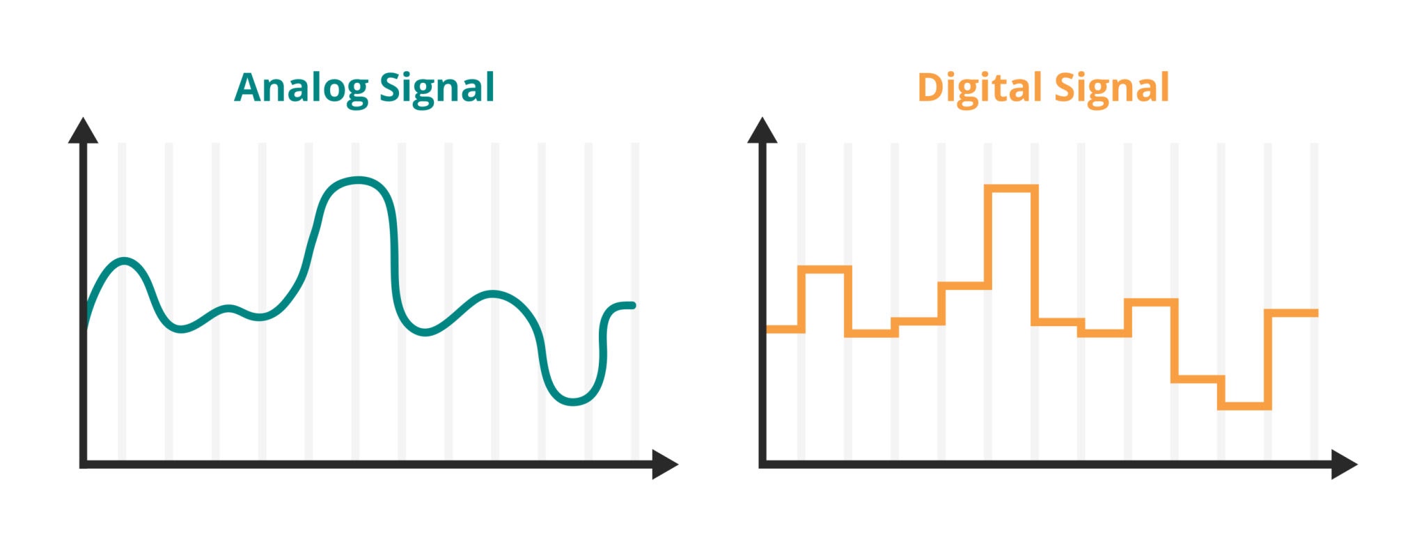
Sampling and Aliasing
In computer vision, we constantly bridge two worlds: the continuous physical world and the discrete digital world.
1. The Sampling Process
The physical world is continuous; light intensity varies smoothly across space. To create a digital image, we must measure (sample) this continuous signal at regular intervals.
- 1D Analogy: Recording audio measures air pressure voltage thousands of times per second.
- 2D (Images): We measure light intensity at a grid of points $(x, y)$. Each measurement becomes a pixel.
2. The Phenomenon of Aliasing
Aliasing occurs when we sample a signal too slowly to capture its variations accurately. The high-frequency patterns in the real world (like fine textures, bricks, or striped shirts) are misinterpreted as lower-frequency patterns (wavy lines or "Moiré patterns") in the image.
Real-world Example: The "Wagon Wheel Effect" in movies. A wheel spinning very fast might appear to spin backward. This is temporal aliasing caused by the camera's frame rate being too slow relative to the wheel's rotation.
3. The Mathematics: Nyquist-Shannon Theorem
How fast do we need to sample to avoid this disaster?
The Nyquist-Shannon Sampling Theorem states that to perfectly reconstruct a signal, the sampling rate ($f_s$) must be strictly greater than twice the maximum frequency ($f_{max}$) present in the signal.
$$f_s > 2 \cdot f_{max}$$
- Nyquist Rate ($2 \cdot f_{max}$): The minimum safe sampling rate.
- Nyquist Frequency ($0.5 \cdot f_s$): The highest frequency a given system can capture accurately.
If a signal contains frequencies higher than the Nyquist frequency, those frequencies "fold over" and appear as lower frequency noise.
4. Interpreting the Code and Visuals
In the code blocks below, we simulate this process using a Checkerboard Pattern, which is mathematically difficult to sample because sharp edges contain infinite high frequencies.
- Fourier Transform (FFT): We use the FFT to view the image in the Frequency Domain.
- Center of plot: Low frequencies (gradual changes).
- Edges of plot: High frequencies (sharp edges/noise).
- Undersampling: We artificially reduce the resolution.
- The Result: You will see the checkerboard distort into large, irregular blobs. This is aliasing. The high-frequency "checks" have masqueraded as low-frequency "blobs" because we didn't have enough pixels to capture the transitions.
# Function to generate a checkerboard pattern
def generate_checkerboard(size, freq):
x = np.linspace(0, 2 * np.pi * freq, size[1])
y = np.linspace(0, 2 * np.pi * freq, size[0])
xv, yv = np.meshgrid(x, y)
checkerboard = 0.5 * (np.sign(np.sin(xv) * np.sin(yv)) + 1) # Create checkerboard pattern
return checkerboard
# Function to compute the Fourier Transform magnitude spectrum
def compute_fourier_transform(image):
f_transform = np.fft.fftshift(np.fft.fft2(image)) # Compute 2D FFT and shift zero frequency to the center
magnitude_spectrum = np.log(np.abs(f_transform) + 1) # Log scale for better visualization
return magnitude_spectrum
# Function to undersample an image
def undersample_image(image, scale_factor):
# Downsample the image by scale_factor
downsampled_image = zoom(image, 1 / scale_factor, order=1)
# Upsample back to original size to visualize aliasing
resampled_image = zoom(downsampled_image, scale_factor, order=0)
return resampled_image
# Generate the sample image
checkerboard_image = generate_checkerboard((256, 256), freq=15)
# Undersample images
undersampled_image = undersample_image(checkerboard_image, scale_factor=4)
properly_sampled_image = undersample_image(checkerboard_image, scale_factor=2)
# Compute Fourier Transforms
ft_checkerboard = compute_fourier_transform(checkerboard_image)
ft_undersampled = compute_fourier_transform(undersampled_image)
ft_properly_sampled = compute_fourier_transform(properly_sampled_image)
# Display images and their Fourier Transforms side by side
fig, axes = plt.subplots(3, 2, figsize=(12, 18))
# Original High-Frequency Checkerboard Pattern
axes[0, 0].imshow(checkerboard_image, cmap='gray')
axes[0, 0].set_title('Original High-Frequency Checkerboard')
axes[0, 0].axis('off')
axes[0, 1].imshow(ft_checkerboard, cmap='gray')
axes[0, 1].set_title('Fourier Transform - Original')
axes[0, 1].axis('off')
# Aliased Image
axes[1, 0].imshow(undersampled_image, cmap='gray')
axes[1, 0].set_title('Aliasing Due to Undersampling')
axes[1, 0].axis('off')
axes[1, 1].imshow(ft_undersampled, cmap='gray')
axes[1, 1].set_title('Fourier Transform - Aliased Image')
axes[1, 1].axis('off')
# Properly Sampled Image
axes[2, 0].imshow(properly_sampled_image, cmap='gray')
axes[2, 0].set_title('Proper Sampling Without Aliasing')
axes[2, 0].axis('off')
axes[2, 1].imshow(ft_properly_sampled, cmap='gray')
axes[2, 1].set_title('Fourier Transform - Properly Sampled Image')
axes[2, 1].axis('off')
plt.tight_layout()
plt.show()

Histograms
An Image Histogram is one of the most important tools in computer vision for analyzing the global statistics of an image. It is a graphical representation of the tonal distribution of a digital image.
1. What is a Histogram?
A histogram plots the frequency of pixel intensity values.
- X-axis: The range of pixel values (usually 0 to 255 for 8-bit integers, or 0.0 to 1.0 for floats).
- Y-axis: The count (frequency) of pixels that have that specific intensity.
Mathematically, for an image with distinct intensity levels $r_k$, the histogram is defined as: $$h(r_k) = n_k$$ where $n_k$ is the number of pixels with intensity $r_k$.
2. The Cumulative Distribution Function (CDF)
The code below also calculates the CDF. While the histogram tells us "how many pixels are gray," the CDF tells us "what percentage of pixels are gray or darker." $$CDF(x) = \sum_{i=0}^{x} h(i)$$ The CDF is crucial for advanced techniques like Histogram Equalization (enhancing contrast).
3. Brightness Adjustment
We can manipulate the histogram by applying arithmetic operations to the pixel values.
- Brightness ($b$): We add a constant bias to every pixel. $$I_{new}(x,y) = I(x,y) + b$$
- Clipping: When adding brightness, values might exceed the maximum (255 or 1.0). We must "clip" the values to stay within the valid range, or integer overflow will occur (causing white pixels to wrap around and become black).
In the following code: We visualize how shifting the pixel values (Brightness) shifts the entire histogram left (darker) or right (brighter).
# Load black and white image
bw_image = color.rgb2gray(data.astronaut())
# Display the black and white image
plt.figure(figsize=(6, 6))
plt.imshow(bw_image, cmap='gray')
plt.title('Original Black and White Image')
plt.axis('off')
plt.show()

def plot_histogram(ax_img, ax_hist, ax_cdf, image, brightness=0):
# Adjust brightness
adjusted_image = np.clip(image + brightness / 255.0, 0, 1)
# Compute histogram and CDF
hist, bins = np.histogram(adjusted_image.ravel(), bins=256, range=[0, 1])
cdf = hist.cumsum()
cdf_normalized = cdf / cdf.max()
# ---- IMAGE ----
ax_img.imshow(adjusted_image, cmap='gray')
ax_img.set_title(f'Adjusted Image (b={brightness})')
ax_img.axis('off')
# ---- HISTOGRAM ----
ax_hist.hist(adjusted_image.ravel(), bins=256, range=[0, 1],
color='black', alpha=0.6)
ax_hist.set_title('Histogram')
ax_hist.set_xlabel('Pixel Intensity')
ax_hist.set_ylabel('Frequency')
ax_hist.grid(True)
# ---- CDF ----
ax_cdf.plot(bins[:-1], cdf_normalized)
ax_cdf.set_title('CDF')
ax_cdf.set_xlabel('Pixel Intensity')
ax_cdf.set_ylabel('Cumulative Frequency')
ax_cdf.grid(True)
brightness_values = [-50, 0, 50]
fig = plt.figure(figsize=(15, 12))
for i, b in enumerate(brightness_values):
ax_img = fig.add_subplot(len(brightness_values), 3, 3*i + 1)
ax_hist = fig.add_subplot(len(brightness_values), 3, 3*i + 2)
ax_cdf = fig.add_subplot(len(brightness_values), 3, 3*i + 3)
plot_histogram(ax_img, ax_hist, ax_cdf, bw_image, brightness=b)
plt.tight_layout()
plt.show()

bw_image
array([[5.83434902e-01, 4.14859216e-01, 2.44058431e-01, ...,
4.75007843e-01, 4.58213333e-01, 4.69121961e-01],
[6.75588235e-01, 5.56006667e-01, 4.49052941e-01, ...,
4.68548627e-01, 4.56501176e-01, 4.55958431e-01],
[7.66334902e-01, 7.00524314e-01, 6.49276078e-01, ...,
4.76406667e-01, 4.62104314e-01, 4.53978431e-01],
...,
[6.81696471e-01, 6.81979216e-01, 6.71889020e-01, ...,
0.00000000e+00, 2.82745098e-04, 0.00000000e+00],
[6.74694510e-01, 6.68532941e-01, 6.64030196e-01, ...,
2.82745098e-04, 3.92156863e-03, 0.00000000e+00],
[6.70482353e-01, 6.63189804e-01, 6.52838824e-01, ...,
0.00000000e+00, 3.92156863e-03, 0.00000000e+00]]) 4. Color Histograms (RGB)
While a grayscale image has a single channel (intensity), color images are typically represented as multichannel arrays. The most common format is RGB (Red, Green, Blue).
Structure of a Color Image
A standard color image is a 3D tensor of shape $(Height, Width, Channels)$.
- Channel 0: Red Intensity
- Channel 1: Green Intensity
- Channel 2: Blue Intensity
Analyzing Channels Independently
We can compute a separate histogram for each color channel. This is useful for:
- White Balance: Detecting if an image has a "color cast" (e.g., too much blue).
- Segmentation: Some objects are easier to identify in specific channels (e.g., vegetation is prominent in the Green channel).
In the following code: We separate the 3D image tensor into three 2D matrices and plot their distributions side-by-side to analyze the color composition of the "Astronaut" image.
# Load an RGB image
rgb_image = data.astronaut()
# Display the RGB image
plt.figure(figsize=(6, 6))
plt.imshow(rgb_image)
plt.title('Original RGB Image')
plt.axis('off')
plt.show()

def plot_rgb_histograms(image):
# Separate the RGB channels
red_channel = image[:, :, 0]
green_channel = image[:, :, 1]
blue_channel = image[:, :, 2]
# Plot the image and histograms
plt.figure(figsize=(15, 5))
# Subplot 1: Display the original RGB image
plt.subplot(1, 4, 1)
plt.imshow(image)
plt.title('RGB Image')
plt.axis('off')
# Subplot 2: Red channel histogram
plt.subplot(1, 4, 2)
plt.hist(red_channel.ravel(), bins=256, color='red', alpha=0.6)
plt.title('Red Channel Histogram')
plt.xlabel('Pixel Intensity')
plt.ylabel('Frequency')
# Subplot 3: Green channel histogram
plt.subplot(1, 4, 3)
plt.hist(green_channel.ravel(), bins=256, color='green', alpha=0.6)
plt.title('Green Channel Histogram')
plt.xlabel('Pixel Intensity')
plt.ylabel('Frequency')
# Subplot 4: Blue channel histogram
plt.subplot(1, 4, 4)
plt.hist(blue_channel.ravel(), bins=256, color='blue', alpha=0.6)
plt.title('Blue Channel Histogram')
plt.xlabel('Pixel Intensity')
plt.ylabel('Frequency')
plt.tight_layout()
plt.show()
# Call the function to display the histograms
plot_rgb_histograms(rgb_image)

5. RGB to Grayscale: Luminance Perception
Converting a color image to grayscale is not as simple as averaging the Red, Green, and Blue values.
The Human Eye and Luminance
The human eye does not perceive all colors with equal brightness. We are essentially:
- Most sensitive to Green light.
- Moderately sensitive to Red light.
- Least sensitive to Blue light.
If we simply averaged the channels ($\frac{R+G+B}{3}$), the image would look "unnatural" because blue objects would appear brighter in the gray image than they do to our eyes in the real world.
The Weighted Formula
To generate a "perceptually correct" grayscale image (Luminance, denoted as $Y$), we use a weighted sum (Dot Product):
$$Y = 0.2989 \cdot R + 0.5870 \cdot G + 0.1140 \cdot B$$
Notice that Green gets nearly 60% of the weight, while Blue gets only 11%.
In the following code: We implement this formula manually using a dot product to flatten the 3 channels into a single channel representing perceptual luminance.
rgb_image = data.astronaut()
def rgb_to_grayscale(image):
# Use the dot product for weighted conversion
grayscale_image = np.dot(image[..., :3], [0.2989, 0.5870, 0.1140])
return grayscale_image
# Convert the RGB image to Grayscale
grayscale_image = rgb_to_grayscale(rgb_image)
# Display both images side by side
plt.figure(figsize=(10, 5))
# Subplot 1: Display the RGB image
plt.subplot(1, 2, 1)
plt.imshow(rgb_image)
plt.title('Original RGB Image')
plt.axis('off')
# Subplot 2: Display the Grayscale image
plt.subplot(1, 2, 2)
plt.imshow(grayscale_image, cmap='gray')
plt.title('Converted Grayscale Image')
plt.axis('off')
plt.tight_layout()
plt.show()

Brightness and Contrast
In the previous section, we analyzed images using histograms. Now, we will modify images using Point Processing. Point processing implies that the value of a pixel in the output image depends only on the value of the corresponding pixel in the input image (and potentially some global parameters), not on its neighbors.
The Linear Model
The most fundamental point operation is the linear transform, often modeled as:
$$g(i,j) = \alpha \cdot f(i,j) + \beta$$
Where:
- $f(i,j)$ is the input pixel value.
- $g(i,j)$ is the output pixel value.
- $\alpha$ (Alpha) controls Contrast (Gain).
- $\beta$ (Beta) controls Brightness (Bias).
1. Understanding Contrast ($\alpha$)
Contrast is the difference in visual properties that makes an object distinguishable from other objects and the background.
- $\alpha > 1$: We expand the dynamic range. Dark pixels become darker, and bright pixels become brighter. This "stretches" the histogram.
- $0 < \alpha < 1$: We compress the dynamic range. The image becomes gray and "flat."
- $\alpha < 0$: This would invert the image (like a film negative).
2. Understanding Brightness ($\beta$)
Brightness is a simple offset added to the pixel values.
- $\beta > 0$: Shifts the entire histogram to the right (brighter).
- $\beta < 0$: Shifts the entire histogram to the left (darker).
3. The "Saturation" Problem (Clipping)
A critical implementation detail in computer vision is handling overflow. Images are typically stored as 8-bit integers (uint8), capable of storing values from 0 to 255.
If we perform the math $200 \times 1.5 = 300$, the result exceeds 255.
- Modulo Arithmetic (Bad): In standard programming,
uint8(300)might wrap around to $300 - 256 = 44$. A bright white pixel suddenly becomes dark gray. - Saturated Arithmetic (Good): We must "clip" or "saturate" the values. Any result $> 255$ becomes $255$. Any result $< 0$ becomes $0$.
In the code below: We use cv2.convertScaleAbs. This OpenCV function performs the linear transformation $\alpha x + \beta$ and automatically handles the saturation (clipping) and data type conversion for us, preventing integer overflow artifacts.
image = color.rgb2gray(data.astronaut())
image = image * 255
def adjust_brightness_contrast(img, alpha=1.0, beta=0):
new_img = cv2.convertScaleAbs(img, alpha=alpha, beta=beta)
return new_img
def plot_adjusted_image(ax_orig, ax_adj, ax_hist, img, alpha=1.0, beta=0):
# Apply brightness & contrast adjustment
adjusted_img = adjust_brightness_contrast(img, alpha=alpha, beta=beta)
# --- Original image ---
ax_orig.imshow(img, cmap='gray')
ax_orig.set_title("Original Image")
ax_orig.axis('off')
# --- Adjusted image ---
ax_adj.imshow(adjusted_img, cmap='gray')
ax_adj.set_title(f"Adjusted (α={alpha}, β={beta})")
ax_adj.axis('off')
# --- Histogram ---
ax_hist.hist(adjusted_img.ravel(), bins=256, range=[0, 256], color='black')
ax_hist.set_title("Histogram")
ax_hist.set_xlabel("Pixel Intensity")
ax_hist.set_ylabel("Frequency")
ax_hist.grid(True)
settings = [
(0.7, -30),
(1.0, 0),
(1.5, 40)
]
fig = plt.figure(figsize=(13, 10))
for i, (alpha, beta) in enumerate(settings):
ax_orig = fig.add_subplot(len(settings), 3, 3*i + 1)
ax_adj = fig.add_subplot(len(settings), 3, 3*i + 2)
ax_hist = fig.add_subplot(len(settings), 3, 3*i + 3)
plot_adjusted_image(ax_orig, ax_adj, ax_hist, image, alpha=alpha, beta=beta)
plt.tight_layout()
plt.show()

Filters
Up to this point, we have performed Point Operations (like brightness and contrast), where a pixel's new value depended only on its own current value.
Now, we move to Neighborhood Operations (or Spatial Filtering). Here, the value of a pixel is determined by the values of the pixels surrounding it. This is the fundamental building block for:
- Blurring (Noise Reduction)
- Sharpening
- Edge Detection
- Feature Extraction (CNNs)
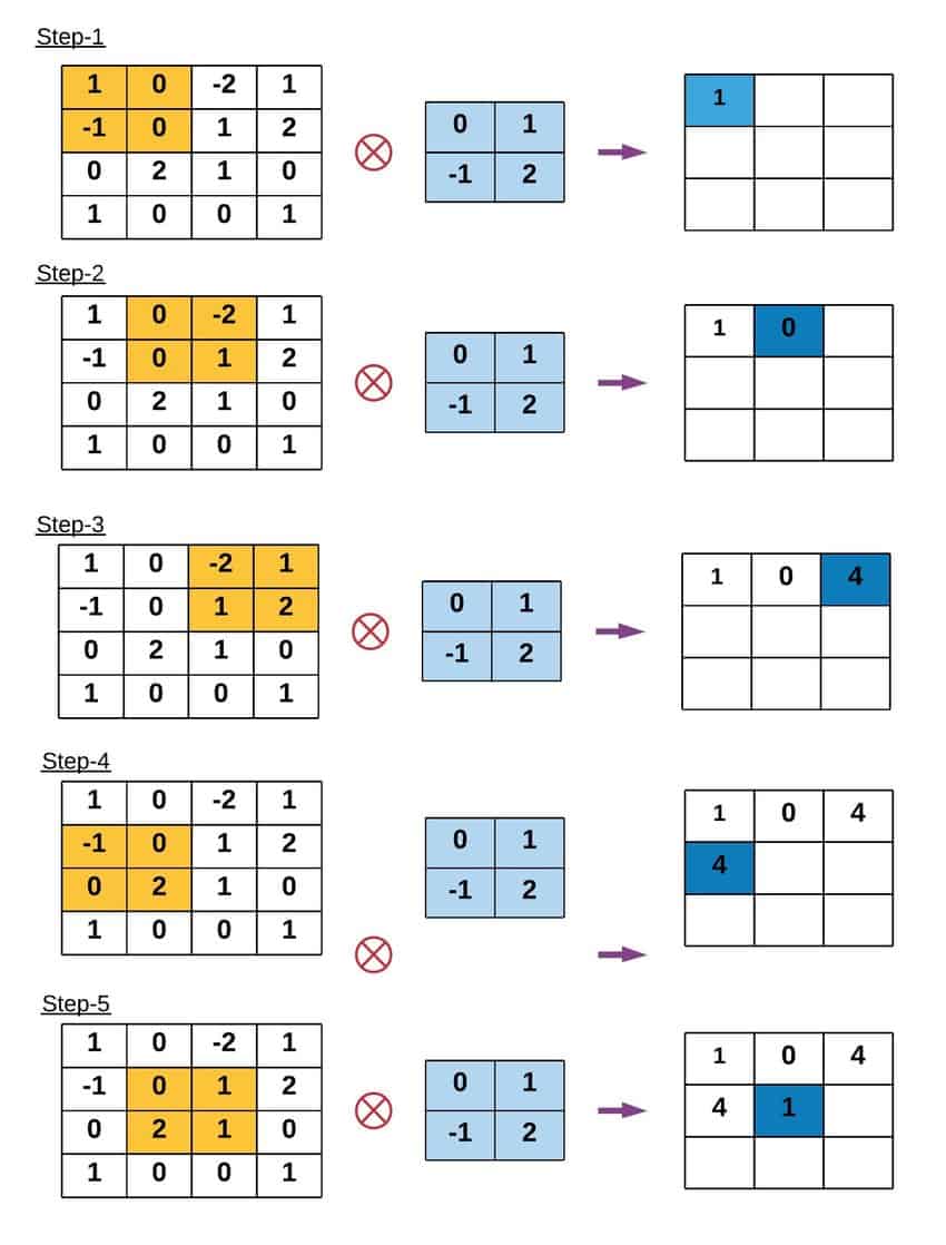
1. The Kernel (The "Filter")
The core of spatial filtering is the Kernel (also called a mask, template, or window). A kernel is a small matrix (usually $3 \times 3$, $5 \times 5$, or other odd numbers) of numbers. These numbers are weights that determine how much influence each neighbor has on the center pixel.
2. The Convolution Operation
To apply a filter, we perform a mathematical operation called Convolution (denoted by the operator $*$). Imagine sliding the kernel over the original image, pixel by pixel. At every position:
- Overlay: Place the center of the kernel over the current pixel $(x, y)$.
- Multiply: Multiply every value in the kernel by the underlying pixel value in the image.
- Sum: Add up all these products.
- Assign: The result becomes the new value of the pixel at $(x, y)$.
Mathematically, for an image $I$ and a kernel $K$ of size $2k+1$: $$G(x, y) = \sum_{u=-k}^{k} \sum_{v=-k}^{k} K(u, v) \cdot I(x-u, y-v)$$
3. Padding (The Border Problem)
When the kernel is at the very edge of an image (e.g., the top-left corner), parts of the kernel will "hang off" the image where no pixels exist. To solve this, we must Pad the image. Common strategies include:
- Zero Padding: Assume pixels outside the image are black ($0$). (Can create dark borders).
- Replicate: Copy the edge pixel values outward.
- Reflect: Mirror the image content across the border (usually the preferred method for natural images).
Gaussian Filter and Box Filter
Smoothing (or blurring) is a technique used to reduce noise and detail in an image. We achieve this by performing convolution with a specific low-pass filter kernel.
1. The Box Filter (Mean Filter)
The simplest smoothing filter is the Box Filter. It replaces the central pixel with the average of all pixels in the kernel window.
- The Kernel: All coefficients are identical. For a $3 \times 3$ kernel, the weights are all $1/9$.
- The Math: $$K_{box} = \frac{1}{9} \begin{bmatrix} 1 & 1 & 1 \\ 1 & 1 & 1 \\ 1 & 1 & 1 \end{bmatrix}$$
- Pros: extremely fast to compute.
- Cons: It produces harsh "boxy" artifacts because it gives equal weight to distant neighbors and immediate neighbors.
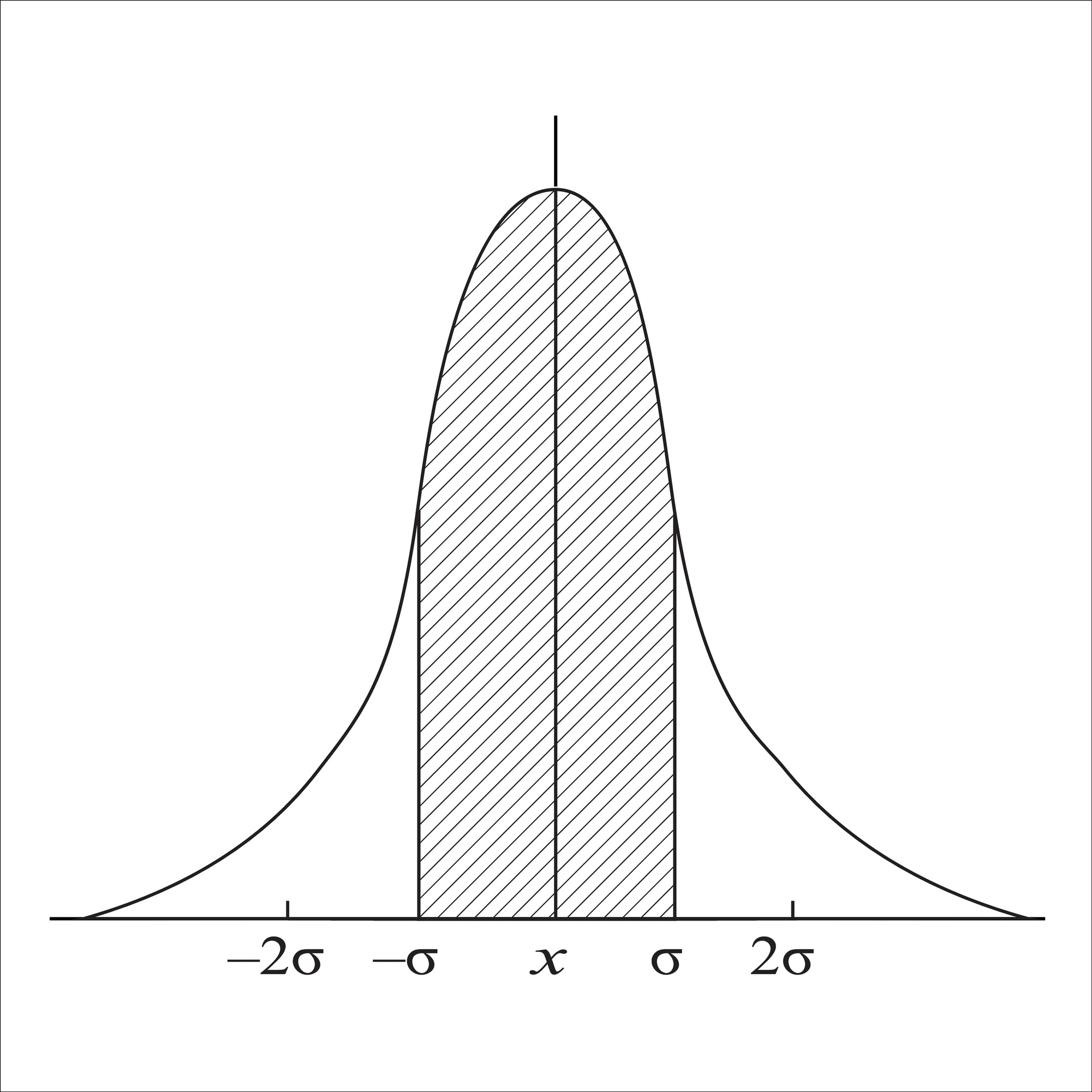
2. The Gaussian Filter
The Gaussian Filter is the most widely used smoothing filter in computer vision. Instead of a simple average, it calculates a weighted average.
- The Kernel: Pixels closer to the center have higher weights; pixels at the edges have lower weights. The weights follow a 2D bell curve.
- The Math: The 2D Gaussian function is defined as: $$G(x, y) = \frac{1}{2\pi\sigma^2} e^{-\frac{x^2+y^2}{2\sigma^2}}$$ Where $\sigma$ (Sigma) determines the width of the bell curve.
In the following code: We visualize the actual numerical weights of these two kernels. Notice how the Box filter looks like a flat plateau (a brick), while the Gaussian filter looks like a smooth hill.
# Function to display Gaussian Kernel
def display_gaussian_and_box_kernels(size, sigma):
# Create 1D Gaussian kernel
kernel_1d = np.linspace(-(size // 2), size // 2, size)
gauss_kernel = np.exp(-0.5 * (kernel_1d / sigma) ** 2)
gauss_kernel = np.outer(gauss_kernel, gauss_kernel) # Create 2D kernel
# Normalize the Gaussian kernel
gauss_kernel = gauss_kernel / gauss_kernel.sum()
# Create a Box filter kernel
box_kernel = np.ones((size, size)) / (size * size)
# Plot Gaussian and Box kernels side by side
plt.figure(figsize=(10, 5))
# Gaussian Kernel
plt.subplot(1, 2, 1)
plt.imshow(gauss_kernel, cmap='viridis')
plt.title(f'Gaussian Kernel (Size: {size}, Sigma: {sigma})')
plt.colorbar()
plt.axis('off')
# Box Filter Kernel
plt.subplot(1, 2, 2)
plt.imshow(box_kernel, cmap='viridis')
plt.title(f'Box Filter Kernel (Size: {size})')
plt.colorbar()
plt.axis('off')
plt.tight_layout()
plt.show()
# Display both filters
display_gaussian_and_box_kernels(size=5, sigma=1)

Deep Dive: Gaussian Parameters ($\sigma$ vs. Kernel Size)
When using a Gaussian filter, we must tune two parameters which are tightly coupled:
Sigma ($\sigma$): This is the standard deviation of the Gaussian distribution. It controls the amount of blurring.
- Small $\sigma$: The bell curve is narrow. Only immediate neighbors influence the center. (Less blur).
- Large $\sigma$: The bell curve spreads out. Distant neighbors have significant influence. (More blur).
Kernel Size ($k$): This is the physical size of the matrix (e.g., $5 \times 5$ or $11 \times 11$).
- Crucial Rule: The kernel size must be large enough to capture the "tails" of the Gaussian curve.
- Rule of Thumb: We usually set the kernel radius to be $3\sigma$ (so the diameter is roughly $6\sigma$). If the kernel is too small for a large $\sigma$, we chop off the curve, resulting in inaccurate blurring.
In the following code: We experiment with different combinations. Notice that increasing $\sigma$ increases the blur strength, but increasing the kernel size without increasing $\sigma$ does not necessarily add more blur—it just adds more zeros (or near-zeros) to the calculation.
image = color.rgb2gray(data.astronaut())
def apply_gaussian_filter(image, kernel_size, sigma, padding='reflect'):
filtered_image = gaussian_filter(image, sigma=sigma, mode=padding)
return filtered_image
# Apply Gaussian filter with different kernel sizes and padding
plt.figure(figsize=(15, 10))
# Filtered images with different Gaussian kernel sizes and paddings
kernel_sizes = [3, 3, 3, 7, 7, 7, 11, 11, 11]
sigmas = [1, 5, 8, 1, 5, 8, 1, 5, 8]
padding_types = ['constant'] * 9
for i, (k, s, p) in enumerate(zip(kernel_sizes, sigmas, padding_types), start=1):
filtered_image = apply_gaussian_filter(image, kernel_size=k, sigma=s, padding=p)
plt.subplot(3, 3, i)
plt.imshow(filtered_image, cmap='gray')
plt.title(f'Kernel Size: {k}, Sigma: {s}, Padding: {p}')
plt.axis('off')
plt.tight_layout()
plt.show()

Deep Dive: Box Filter Artifacts
While the Box filter effectively removes noise, it introduces a specific type of distortion known as anisotropy (directionally dependent).
Because the kernel is a square, it blurs differently along the diagonals than it does along the X and Y axes.
- Aliasing: In the frequency domain, a Box filter (which is a rectangular pulse) corresponds to a Sinc function ($\frac{\sin(x)}{x}$). The Sinc function has infinite ripples (side lobes).
- Visual Result: These "ripples" manifest in the image as "ringing" or blocky artifacts around sharp edges.
In the following code: As we increase the size of the box filter, pay attention to the bokeh (the way out-of-focus points look). They will look like distinct squares rather than smooth circles.
def apply_box_filter(image, kernel_size, padding='reflect'):
filtered_image = uniform_filter(image, size=kernel_size, mode=padding)
return filtered_image
plt.figure(figsize=(15, 10))
kernel_sizes = [3, 7, 9, 11, 13, 15, 17, 19, 21]
padding_types = ['constant'] * 9
for i, (k, p) in enumerate(zip(kernel_sizes, padding_types), start=1):
filtered_image = apply_box_filter(image, kernel_size=k, padding=p)
plt.subplot(3, 3, i)
plt.imshow(filtered_image, cmap='gray')
plt.title(f'Kernel Size: {k}, Padding: {p}')
plt.axis('off')
plt.tight_layout()
plt.show()

Final Comparison: Box vs. Gaussian
Why do we almost always prefer Gaussian over Box filters in modern Computer Vision?
- Rotational Invariance: A Gaussian circle is symmetric. It smooths the image equally in all directions. A Box filter is a square; it smooths corners differently than edges.
- Frequency Domain Behavior:
- Gaussian: The Fourier Transform of a Gaussian is also a Gaussian. It smoothly attenuates high frequencies without adding noise.
- Box: The Fourier Transform is a Sinc function. It leaks high-frequency energy back into the image (ringing), which can create false edges.
In the code below: We compare them side-by-side with a large kernel. Look closely at the edges of the astronaut's suit. The Box filter will make them look blocky/pixelated, while the Gaussian filter produces a soft, natural haze.
kernel_size = 21
sigma = 5
gaussian_filtered_image = apply_gaussian_filter(image, kernel_size=kernel_size, sigma=sigma)
box_filtered_image = apply_box_filter(image, kernel_size=kernel_size)
plt.figure(figsize=(18, 6))
# Original Image
plt.subplot(1, 3, 1)
plt.imshow(image, cmap='gray')
plt.title('Original Image')
plt.axis('off')
# Gaussian Filtered Image
plt.subplot(1, 3, 2)
plt.imshow(gaussian_filtered_image, cmap='gray')
plt.title(f'Gaussian Filter (Kernel Size: 21, Sigma: {sigma})')
plt.axis('off')
# Mean Filtered Image
plt.subplot(1, 3, 3)
plt.imshow(box_filtered_image, cmap='gray')
plt.title(f'Mean Filter (Kernel Size: {kernel_size})')
plt.axis('off')
plt.tight_layout()
plt.show()

Non-Linear Filtering
We have seen that linear filters (like Gaussian and Box) smooth an image by averaging neighbors. The problem? They blur everything equally. They cannot distinguish between "noise" (which we want to remove) and "edges" (which we want to keep).
To solve this, we need Non-Linear Filters. These filters look at the values of the neighbors before deciding whether to include them in the average.
1. Median Filter (The outlier killer)
Instead of averaging the neighbors, we sort them and pick the median value.
- How it works: If a pixel is bright white (255) surrounded by dark gray (100), the average would be pulled up (e.g., 120). The median, however, will completely ignore the 255 because it is an outlier at the end of the sorted list.
- Best for: Salt-and-Pepper Noise (random white/black dots).
2. Bilateral Filter (The edge preserver)
This is an extension of the Gaussian filter. It calculates weights based on two Gaussian distributions:
- Spatial Gaussian: Weights pixels lower if they are far away (like a standard Gaussian).
- Range (Intensity) Gaussian: Weights pixels lower if their intensity is very different from the center pixel.
- The Concept: "I will only average my neighbors if they are close to me AND look like me." This prevents averaging across edges.
3. Anisotropic Diffusion (Total Variation)
Note: The code below uses Total Variation (TV) denoising, which is mathematically related to Anisotropic Diffusion. This method treats smoothing as a flow process. It encourages smoothing within flat regions but "stops" the flow at boundaries (edges). It is famous for creating a "cartoon-like" effect where textures are removed but sharp contours remain.
4. Non-Local Means (NLM)
Most filters look at the immediate $3 \times 3$ or $5 \times 5$ neighborhood. NLM assumes that natural images have redundant patterns (repeating textures).
- How it works: To denoise pixel $A$, it searches the entire image (or a large window) for patches that look similar to the patch around $A$, even if they are far away. It averages those similar patches together.
- Best for: High-quality denoising of Gaussian noise while preserving texture.
def apply_filters(image):
# Apply Median Filter
median_filtered = np.zeros_like(image)
for i in range(3):
median_filtered[:, :, i] = median(image[:, :, i], disk(3))
# Apply Bilateral Filter
bilateral_filtered = denoise_bilateral(image, sigma_color=0.05, sigma_spatial=15, channel_axis=-1)
# Apply Anisotropic Diffusion (Perona-Malik Filter)
anisotropic_filtered = restoration.denoise_tv_chambolle(image, weight=0.1)
# Apply Nonlocal Means Filter
nonlocal_filtered = restoration.denoise_nl_means(image, h=0.1, fast_mode=True, patch_size=5, patch_distance=3, channel_axis=-1)
# Plot the results
plt.figure(figsize=(15, 10))
plt.subplot(2, 3, 1)
plt.imshow(image)
plt.title('Original Image')
plt.axis('off')
plt.subplot(2, 3, 2)
plt.imshow(median_filtered)
plt.title('Median Filter')
plt.axis('off')
plt.subplot(2, 3, 3)
plt.imshow(bilateral_filtered)
plt.title('Bilateral Filter')
plt.axis('off')
plt.subplot(2, 3, 4)
plt.imshow(anisotropic_filtered)
plt.title('Anisotropic Diffusion')
plt.axis('off')
plt.subplot(2, 3, 5)
plt.imshow(nonlocal_filtered)
plt.title('Nonlocal Means Filter')
plt.axis('off')
plt.tight_layout()
plt.show()
image = data.astronaut()
apply_filters(image)

Scenario A: Salt & Pepper Noise (Impulse Noise)
Salt and Pepper noise randomly corrupts pixels, turning them either fully black ($0$) or fully white ($255$). This simulates dead pixels on a sensor or data transmission errors.
What to watch for:
- Median Filter: Look at how it perfectly reconstructs the image. It is mathematically impossible for a linear filter (like Gaussian) to remove this noise without blurring the image significantly.
- Others: Notice how Bilateral and NLM struggle here; they might smear the white dots rather than removing them.
noisy_image = util.random_noise(image, mode='s&p', amount=0.1)
apply_filters(noisy_image)

Scenario B: Gaussian Noise
Gaussian noise adds random statistical variations to every single pixel's intensity. This simulates high-ISO sensor noise (grain) in low-light photography.
What to watch for:
- Median Filter: It will make the image look "patchy" or like a painting. It is not ideal for this type of noise.
- Bilateral & NLM: These shine here. They should reduce the grain in the background (smooth regions) while keeping the edges of the astronaut sharp.
gaussian_noise = util.random_noise(image, mode='gaussian', var=0.03)
apply_filters(gaussian_noise)

Scenario C: Speckle Noise
Speckle noise is multiplicative noise (noise = image $\times$ random_variation). This is common in coherent imaging systems like Radar, Sonar, or Medical Ultrasound.
What to watch for: Because the noise depends on the signal strength (brighter areas have more noise), this is the hardest challenge. Total Variation (Anisotropic) often does a decent job here by trying to flatten the variation in the bright regions.
speckle_noise = util.random_noise(image, mode='speckle', var=0.1)
apply_filters(speckle_noise)
